401+ Orange PFP Ideas: Aesthetic, Anime, Cute, Discord, Cat and More
Orange PFPs are deceptively hard to get right. The color itself does a lot of heavy lifting — warm, bold, immediately readable — but the wrong style and it just looks like you grabbed the first thing that came up on Google Images. The right one, though? Your profile pops on every platform, dark mode or not.
This collection covers every orange PFP direction worth knowing: soft aesthetic edits, anime character frames, cute kawaii illustrations, plain and border styles, Discord-optimized designs, funny orange cat options, and even cinematic picks for the Clockwork Orange fans. Drop them directly on chatpic for anonymous image sharing and try a few before you commit.
Why Orange Works So Well as a Profile Picture Color
Orange sits at a sweet spot between warm and bold — approachable enough to not be aggressive, vivid enough to actually stand out on crowded feeds and dark-mode servers.
Most colors have a ceiling on where they work. Pale blue reads great on Instagram but disappears on Discord. Neon green pops in gaming spaces but looks chaotic on a curated lifestyle profile. Orange doesn’t have that problem. It reads clearly on light and dark backgrounds, scales well when compressed to tiny avatar sizes, and carries genuine emotional weight: energy, confidence, creativity, warmth.
The color also has deep roots in online subcultures. Anime fandoms, lo-fi aesthetic communities, Y2K nostalgia boards, Halloween and autumn aesthetics — orange shows up constantly across all of them. Choosing it as your PFP color puts you in some well-established visual company.
Orange PFP Aesthetic Styles Worth Using
Aesthetic orange PFPs lean into the softer, more considered side of the color — sunset gradients, amber overlays, film grain textures, and compositions that feel intentional rather than random.
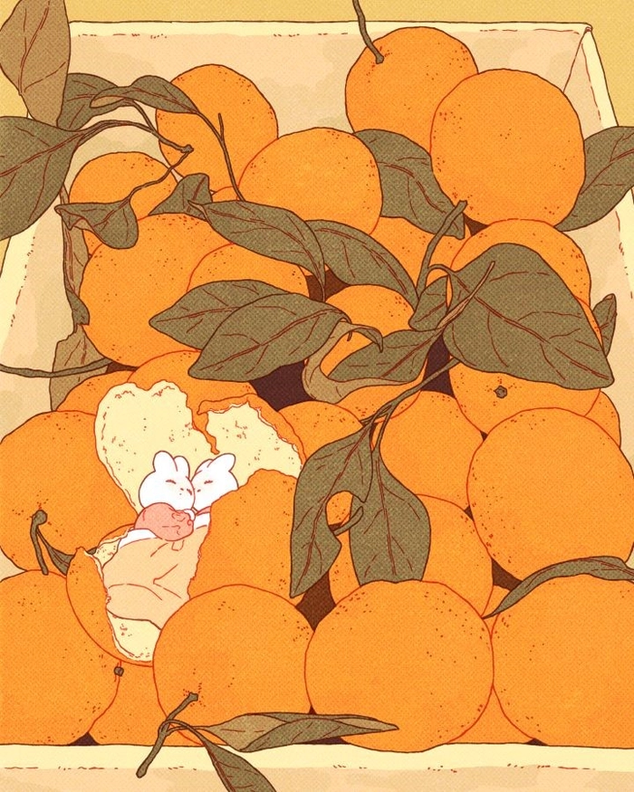
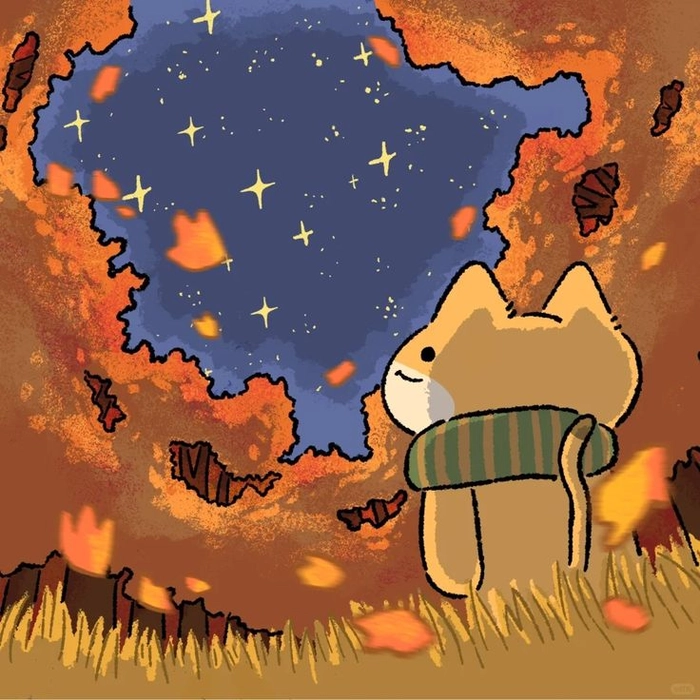
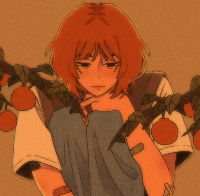
The tones here never feel aggressive. Muted amber and warm peach sit comfortably next to curated feeds, dark profile themes, and lifestyle content alike. If your goal is to look creative and self-aware without putting in a lot of effort, this is your direction.
Orange Anime PFPs That Actually Look Good at Avatar Size
Orange is practically embedded in anime visual identity — Naruto Uzumaki, Ichigo Kurosaki from Bleach, and Escanor from Seven Deadly Sins have made it one of the most fandom-coded colors in the medium.
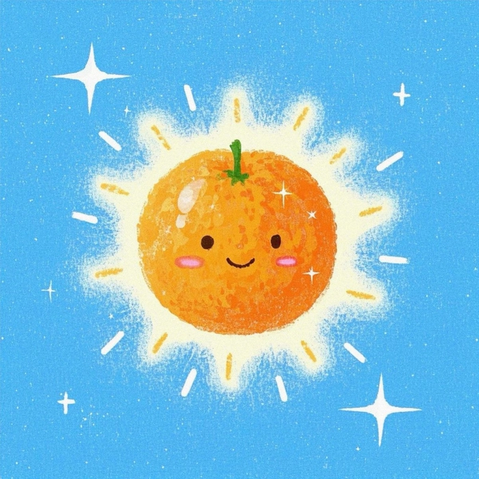
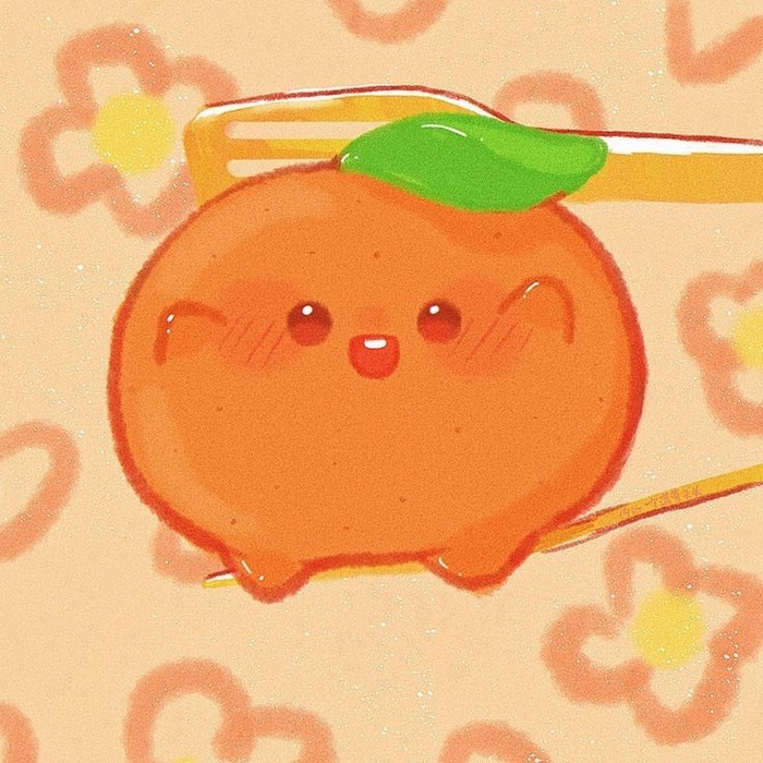
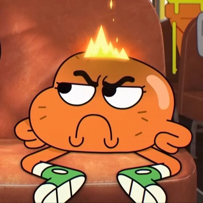
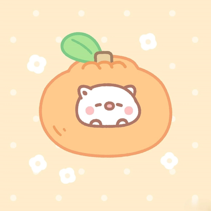
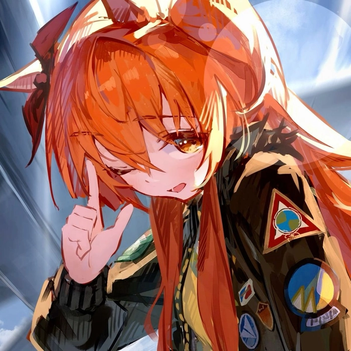
In Discord fan servers and gaming communities, an anime orange PFP registers the fandom allegiance before your username even loads. Bold outlines and high-contrast shading hold up best when avatars are compressed — avoid anything too detailed in the background.
Orange Girl PFPs with Warm Portrait Energy
Orange girl PFPs use copper tones, golden-hour lighting, and clean backgrounds to create portraits that feel polished without being over-produced.
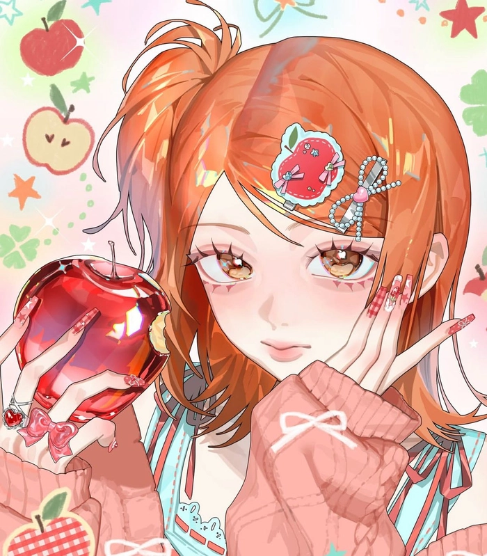
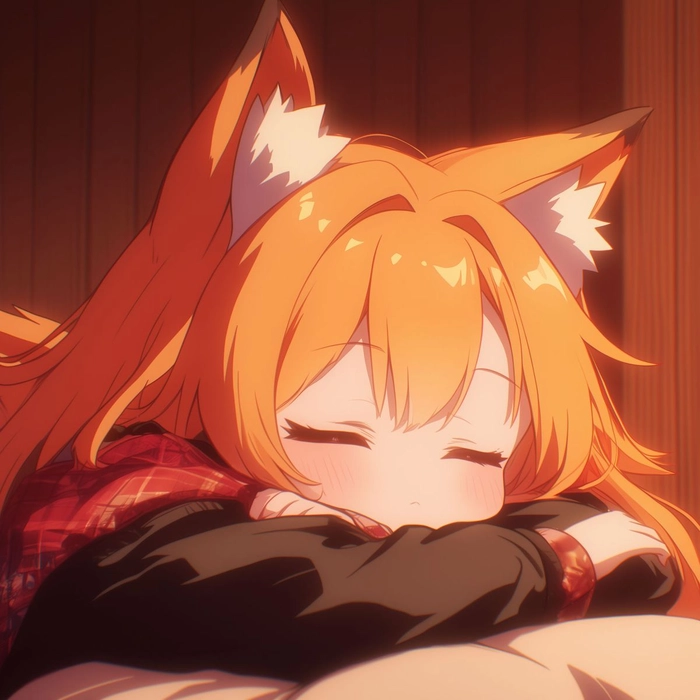
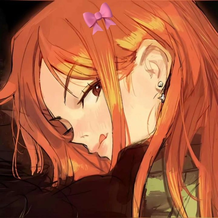
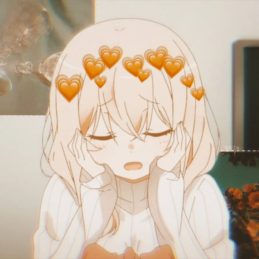
Orange complements skin tones in a way that cooler palettes genuinely can’t replicate. The sunlit warmth reads naturally on TikTok and Instagram, especially for creators who use consistent visual branding across their content.
Cute Orange PFPs That Feel Friendly, Not Loud
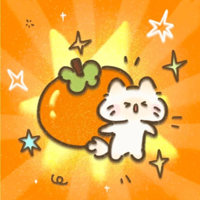
Cute orange PFPs go light on the saturation and heavy on charm: rounded shapes, cartoon-style characters, soft pastel shades, and little details like sparkles or blush marks.
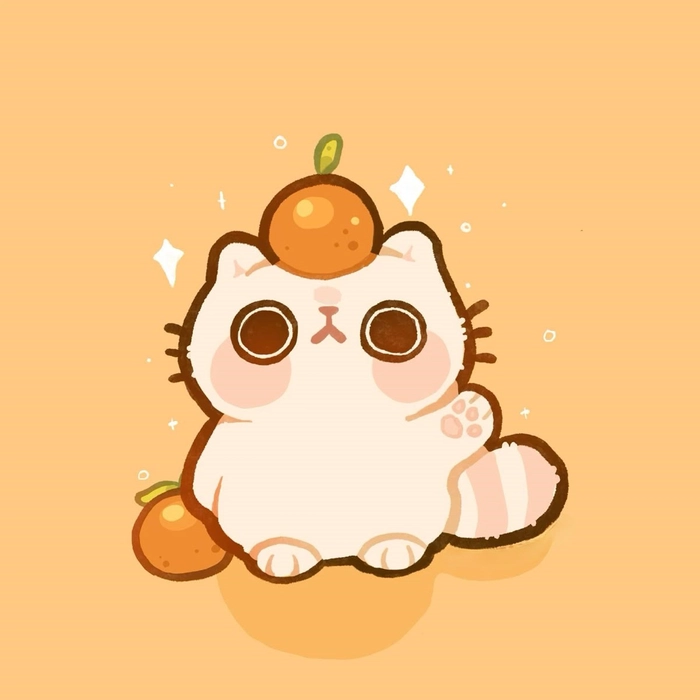
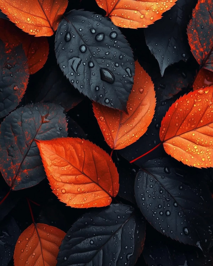
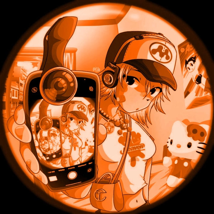
The style overlaps heavily with kawaii and Sanrio-adjacent aesthetics — cutecore energy without going full character costume. These work well in casual Discord servers and friend group chats where approachable beats impressive every time.
Orange PFP Ideas for Mixing Styles
The most interesting orange PFPs come from combining categories: an anime character with an aesthetic color grade, a cartoon illustration on a dark background, a minimalist design with a single texture overlay.
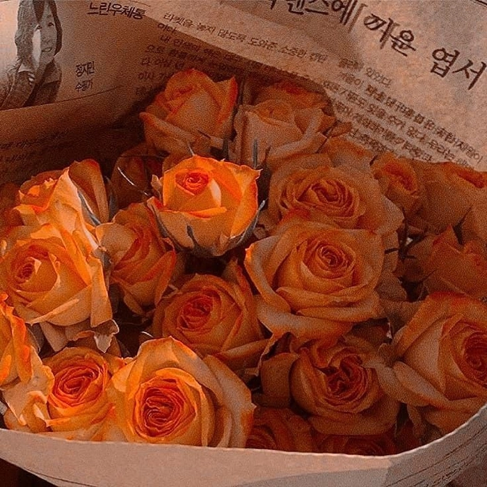
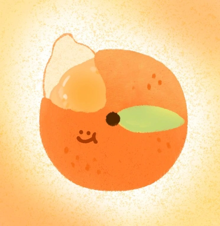
Orange is flexible enough that it reads clearly across almost any style, which makes experimenting low-risk. Start with the platform you use most and let that guide the direction: Discord rewards contrast, Instagram rewards warmth, TikTok rewards personality.
What Orange PFPs Say About You Online
An orange PFP signals warmth and confidence without needing to be aggressive about it — it’s the color choice of someone who thought about how their profile reads, not someone who clicked the first result.
In fandom spaces, orange carries specific allegiances. Naruto fans, Bleach fans, sports community members, and gaming guilds all have strong orange traditions. In aesthetic communities it connects to autumn, golden hour, and mood-board culture. Across both groups, it reads as someone treating their profile as a real expression of identity rather than a default placeholder.
The shade shifts the reading too. Burnt amber says artistic and grounded. Bright tangerine says playful and loud. Deep rust says moody and serious. Neon orange says chaotic-coded on purpose. Pick based on what you actually want people to think when they see your avatar.
Orange Background and Plain PFPs for Minimal Profiles
Background and plain orange PFPs let the color do all the work — no characters, no faces, just orange in whatever shade and texture makes the most sense for your vibe.
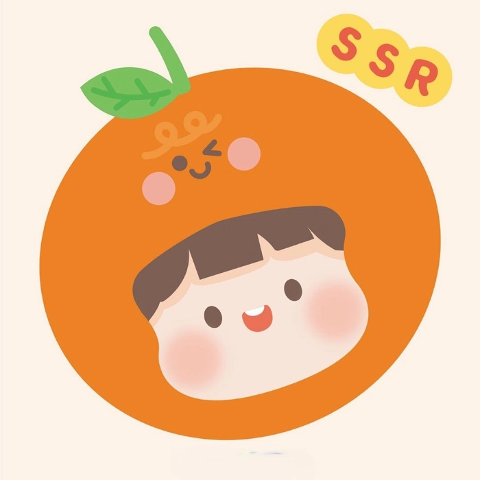
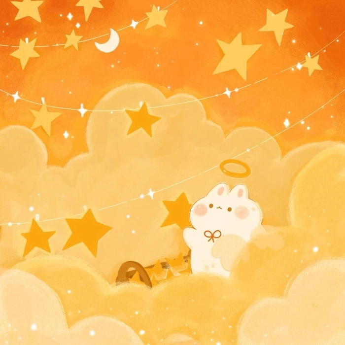

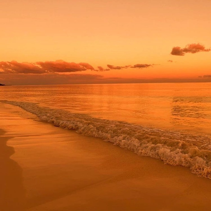
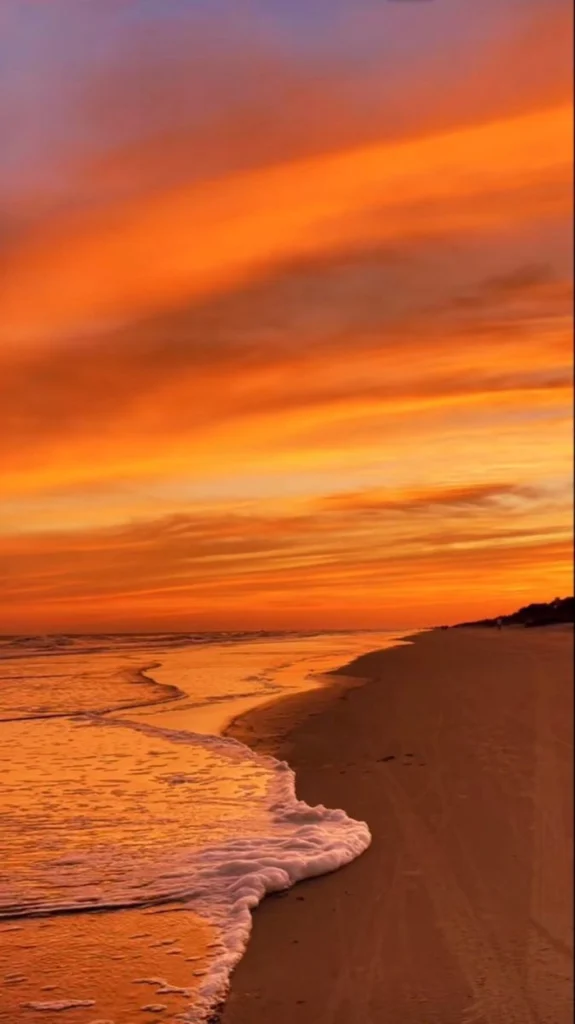
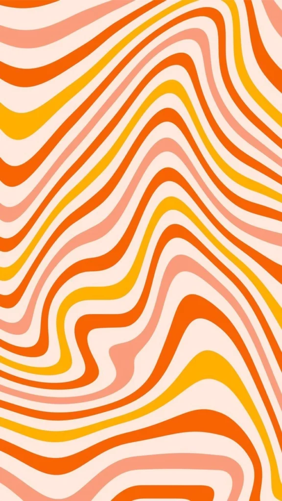
Plain backgrounds scale cleanly at small sizes and look equally sharp on light and dark interfaces. For anyone who wants something versatile without committing to a character or face, this is the most flexible option in the collection.
Orange Discord PFPs That Hold Up in Fast-Moving Chats
Orange is one of the best PFP colors for Discord specifically — the platform’s dark interface creates natural contrast for warm saturated tones, and orange hits the sweet spot between readable and eye-catching.
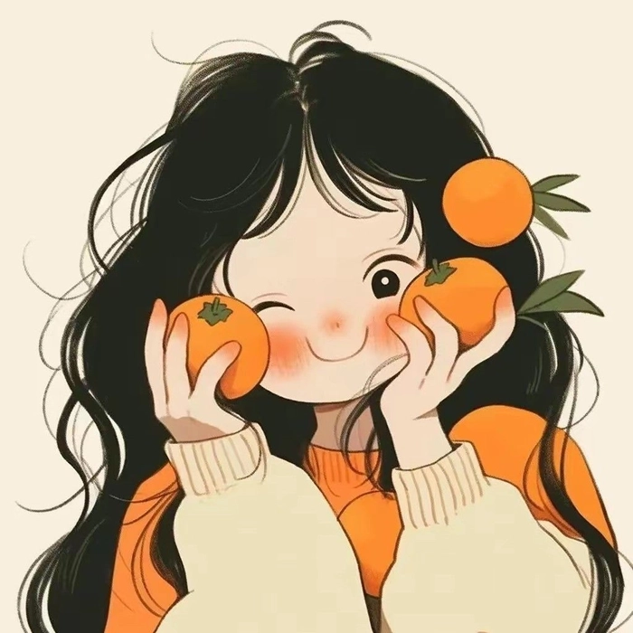
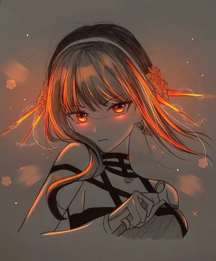
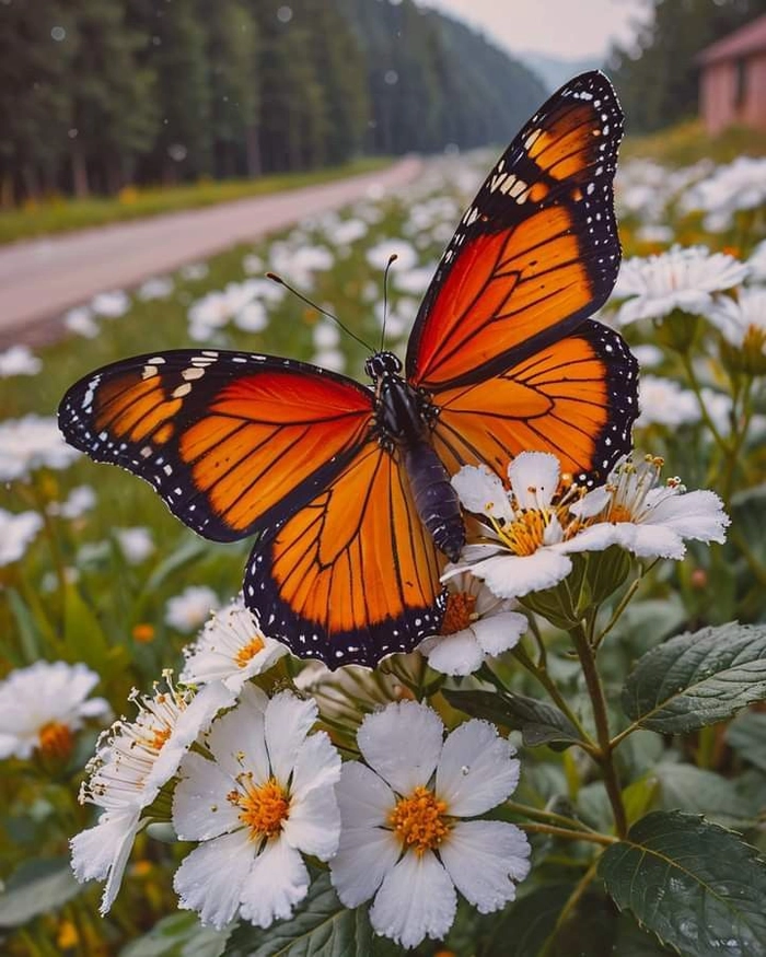
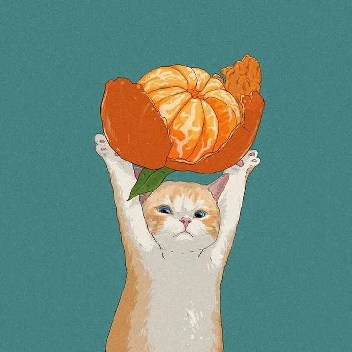
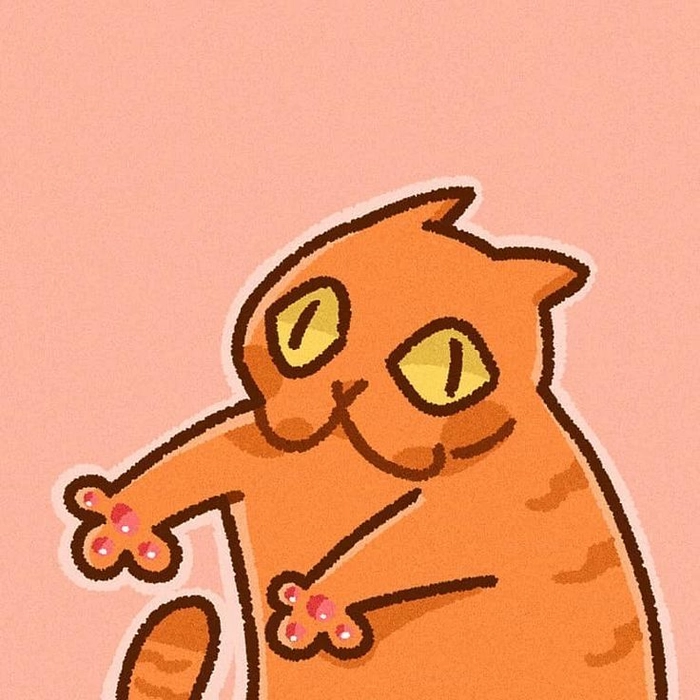
Discord compresses avatars heavily, so the most effective options here prioritize bold central focus and strong contrast over soft gradients or fine textures. A strong orange avatar registers before the username does in any fast-moving server.
Orange Border PFPs for Extra Visual Finish
An orange frame gives any avatar a completed, intentional quality — the border adds depth without cluttering the subject, and it survives the circular crop on every platform.
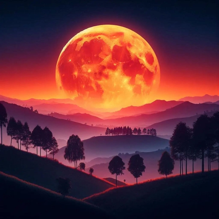
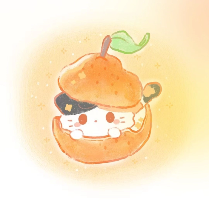
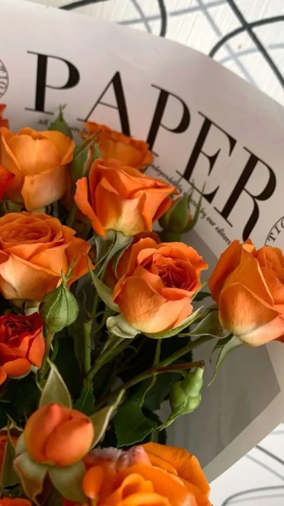
A thick orange border around a dark portrait creates immediate contrast. The same frame on a light image anchors it and stops the edges from disappearing on white backgrounds. Practical beyond just the aesthetic effect.
Animated Orange GIF PFPs for Maximum Attention
Animated orange PFPs take the color’s natural energy and add motion to it — glowing loops, flickering flame effects, and smooth transitions that draw the eye passively in any server or comment section.
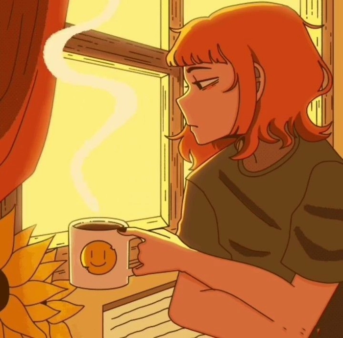
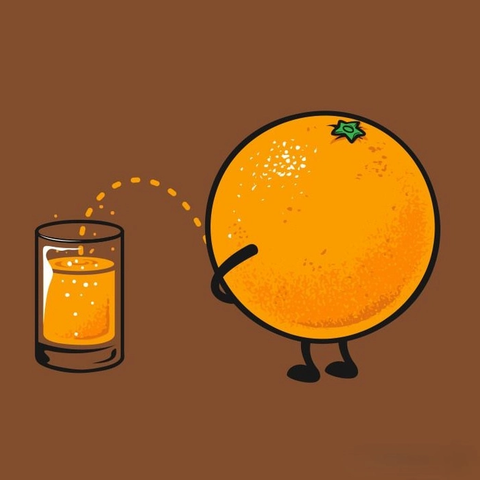
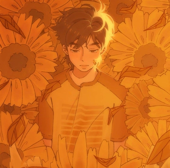
GIF avatars are supported on Discord Nitro and some Instagram settings. Gaming communities favor them because motion reads as engagement. Warm tones in motion feel genuinely alive in a way that cooler palettes rarely pull off.
Orange Pinterest PFPs with Curated Mood-Board Energy
Pinterest orange PFPs represent the color at its most considered: warm without being washed out, edited without being over-processed, styled without losing the personal feel.
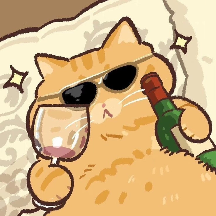
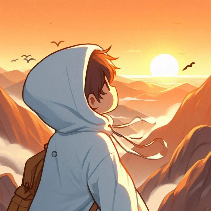
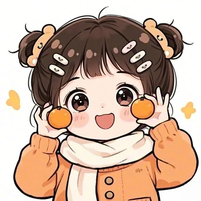
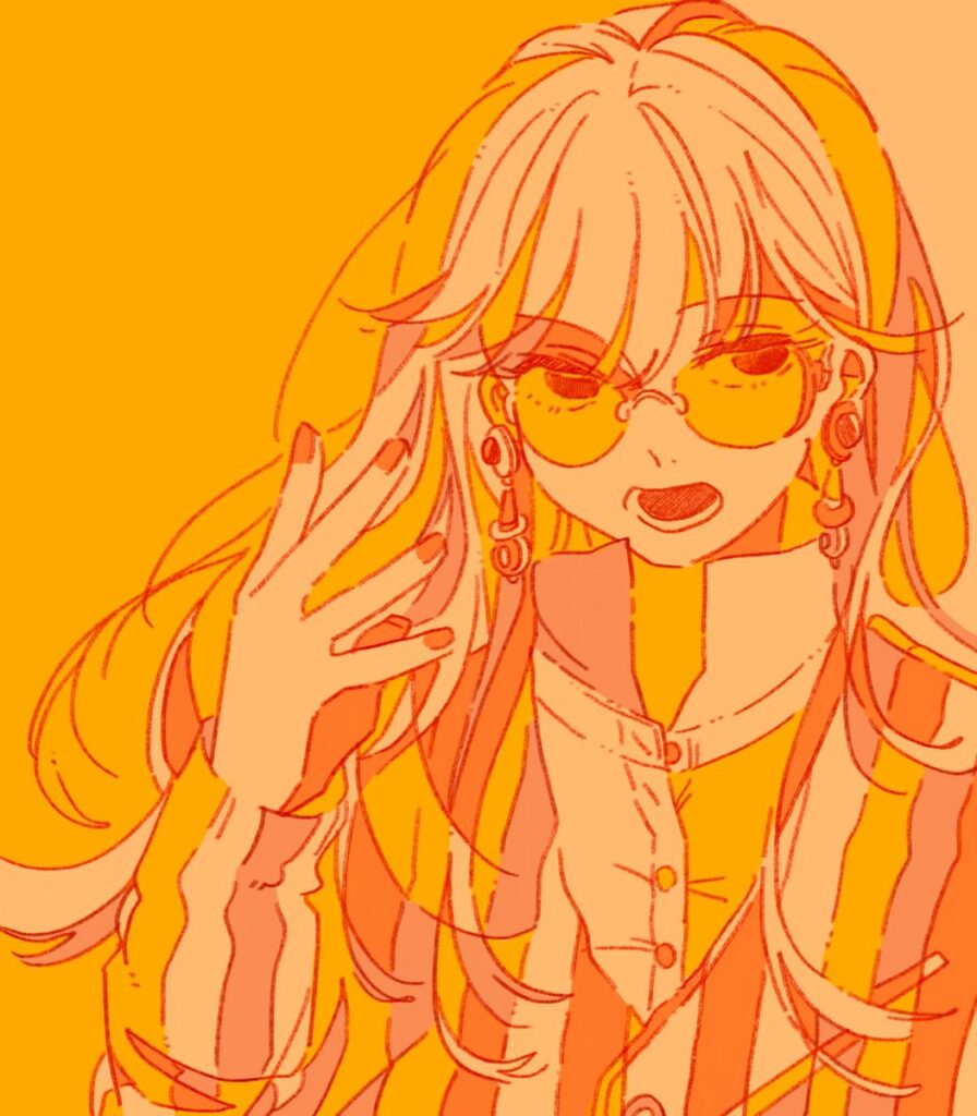
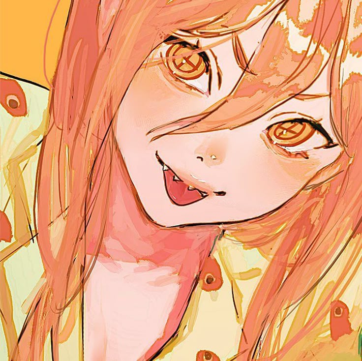
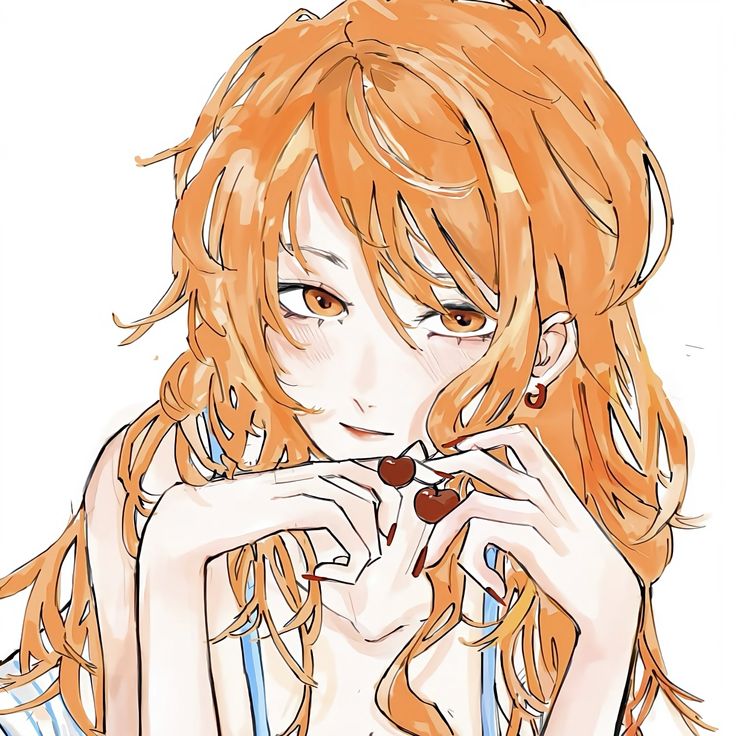
Autumn aesthetics, golden hour photography, dried flower palettes, and desert landscape edits all pull from the same orange-adjacent color space that defines Pinterest mood boards. Using one of these as your PFP signals taste-driven, intentional visual identity without having to explain any of it.
Soft Cute Orange PFPs with Cozy Emotional Warmth
These go beyond cartoon-cute into something more emotionally warm: cozy illustrations, gentle expressions, soft shading, and the kind of palette you associate with someone who has a calm, low-drama online presence.
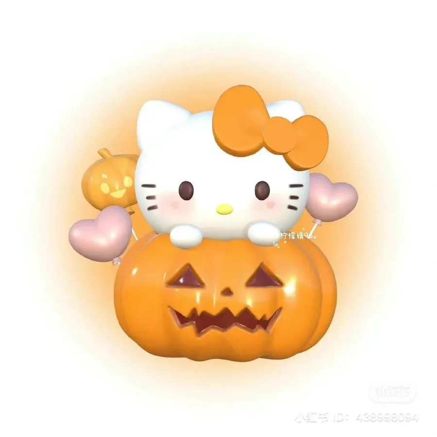
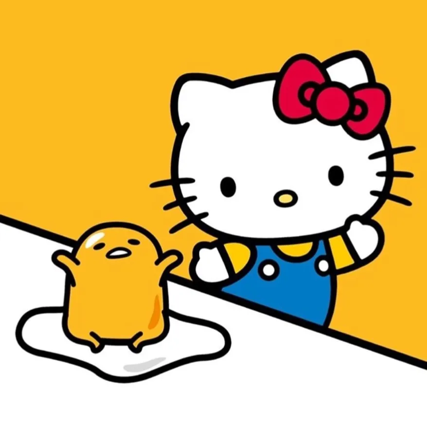
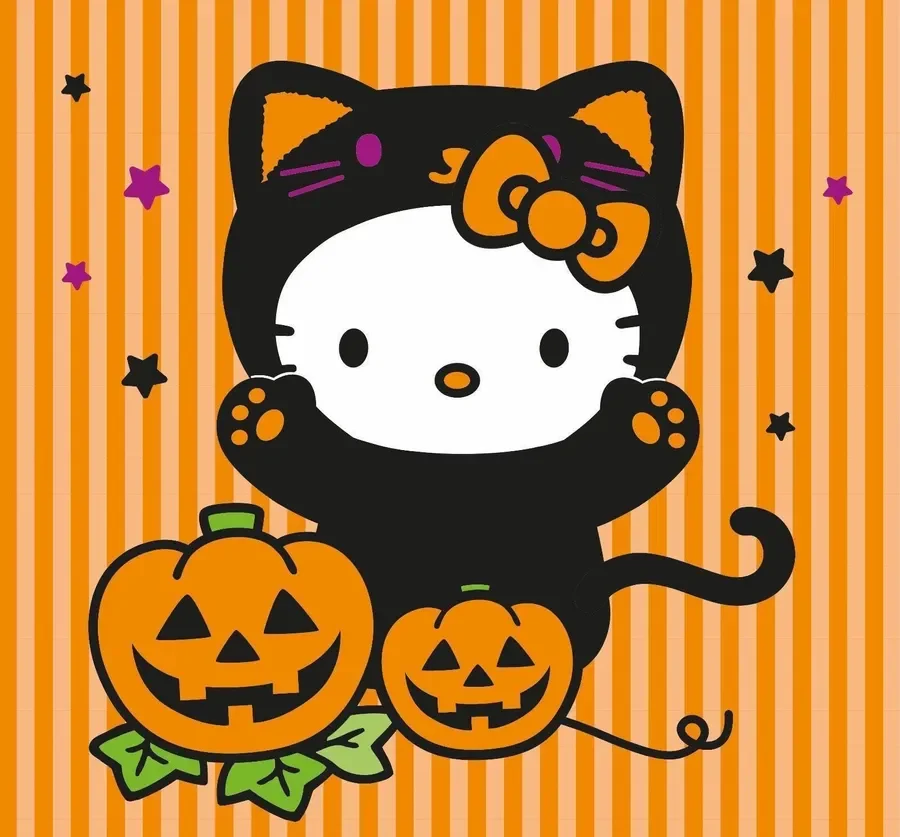
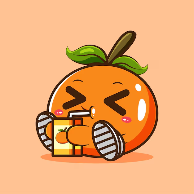
Orange in this context acts more like an emotional cue than a style statement. Approachable, friendly, a little nostalgic. The PFP equivalent of an autumn-themed profile setup — it communicates comfort without needing to explain itself.
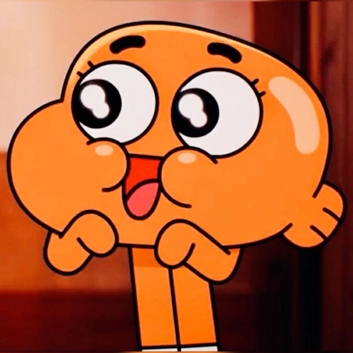
Annoying Orange PFPs for Deliberately Chaotic Profiles
Nobody accidentally picks an Annoying Orange PFP — it’s a deliberate choice to look chaotic and funny, and that commitment communicates personality more effectively than most people expect.
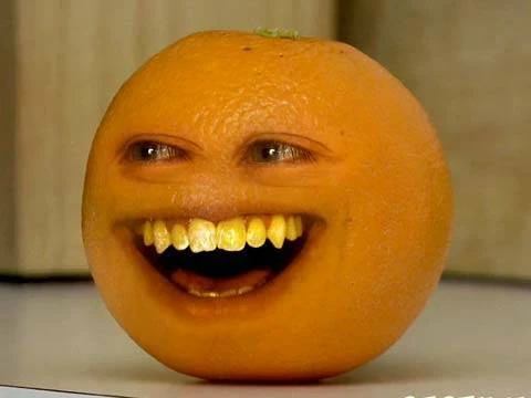
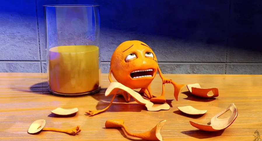
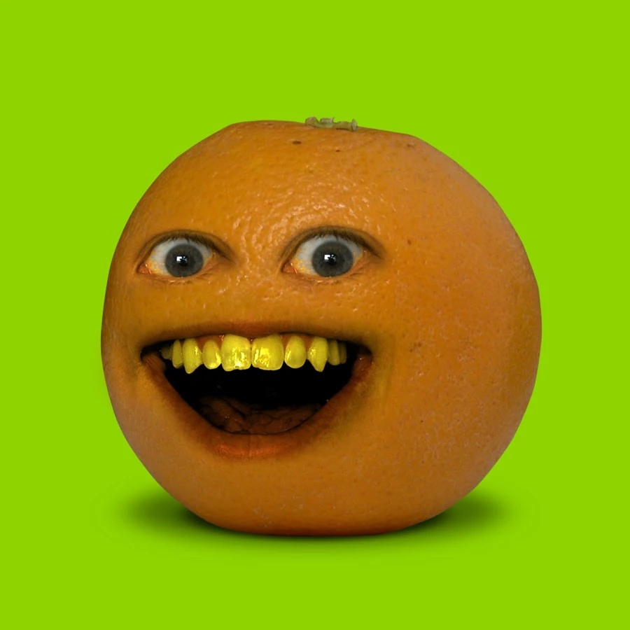
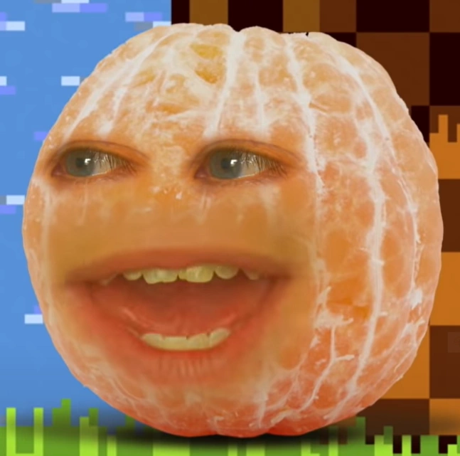
The Annoying Orange YouTube channel launched in 2009 and became an early meme format before the word “meme” was even mainstream vocabulary. Using one now carries that whole legacy, and it still lands in gaming servers and nostalgia-coded spaces because of exactly that history.
Clockwork Orange PFPs for Counter-Culture Cinephiles
Clockwork Orange PFPs tap into a specific corner of online identity: film-literate, deliberately provocative, comfortable being misread by people who don’t recognize the reference.
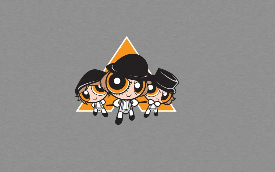
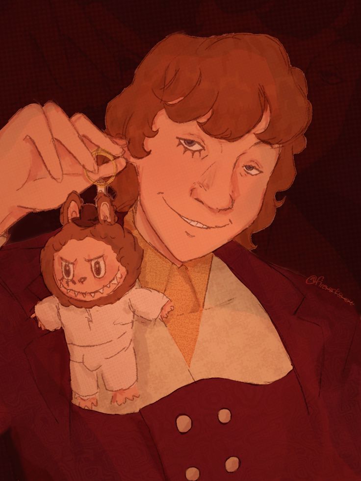
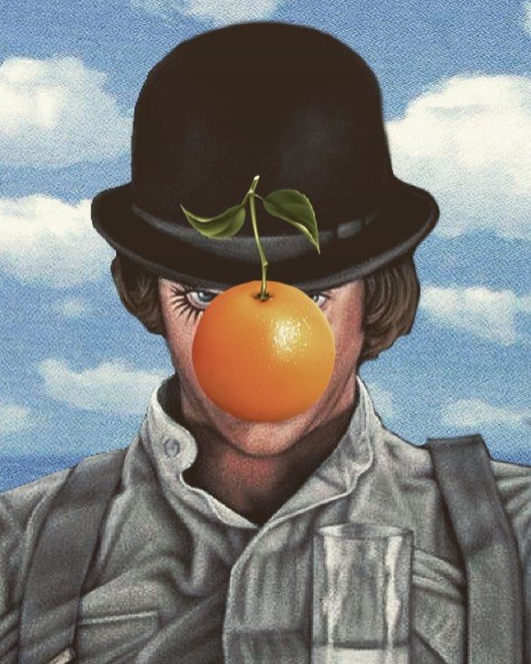
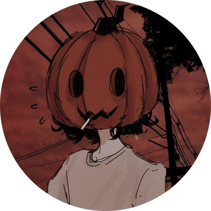
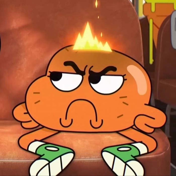
The Kubrick film’s deep orange-and-black palette creates avatars that look genuinely striking even to people who have no idea what they’re looking at. One of the rare film references in PFP culture that holds up cinematically as a standalone visual.
Black and Orange PFPs That Work on Every Platform
Black and orange is one of the most effective two-color combinations in PFP design — immediate contrast, strong visual impact, and it works on dark-mode Discord and white-background Instagram equally well.
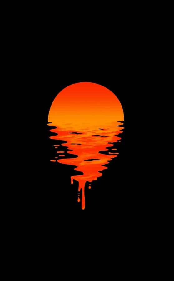
The combination sits at the intersection of Halloween aesthetics, cyberpunk color palettes, and grunge-adjacent design traditions. Anyone who identifies with any of those spaces will find this fits their broader online visual language without forcing it.
Best Orange PFP Ideas for Every Style Direction
The best orange PFP ideas match the shade to the platform and the personality: soft amber for aesthetic and Pinterest, saturated tangerine for Discord and gaming, muted rust for grunge vibes, neon orange for chaos-coded identities.
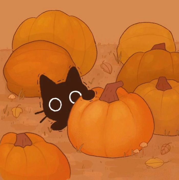
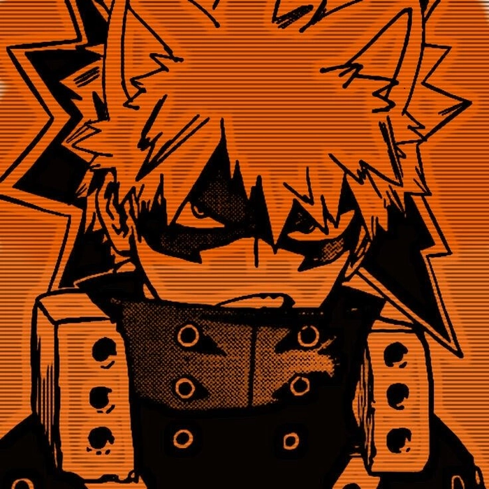
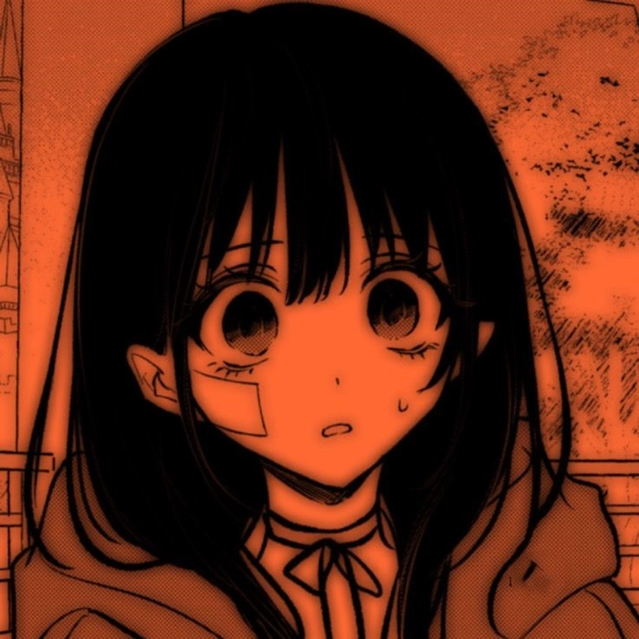
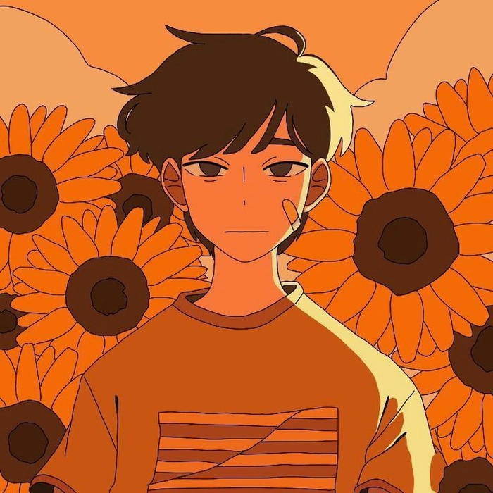
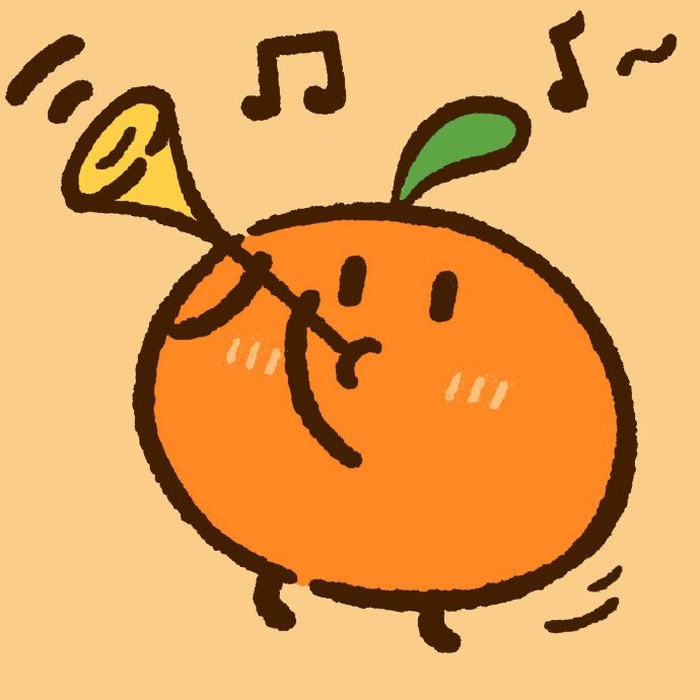
Orange is wide enough as a color that two people can pick completely different interpretations and both feel authentically represented. Start with the feeling you want your profile to project, then find the shade and style that delivers it.
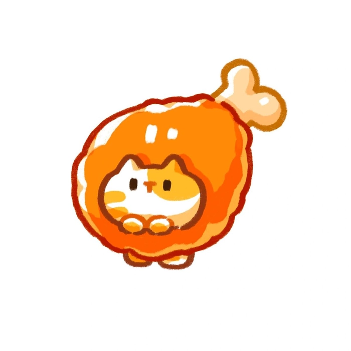
Funny Orange Cat PFPs with Built-In Meme Credibility
The orange tabby has become its own meme archetype: chaotic, lovable, slightly unhinged — and using one as your PFP plugs directly into that collective online personality without any explanation needed.
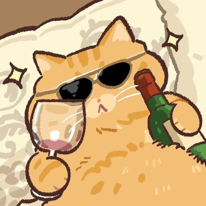
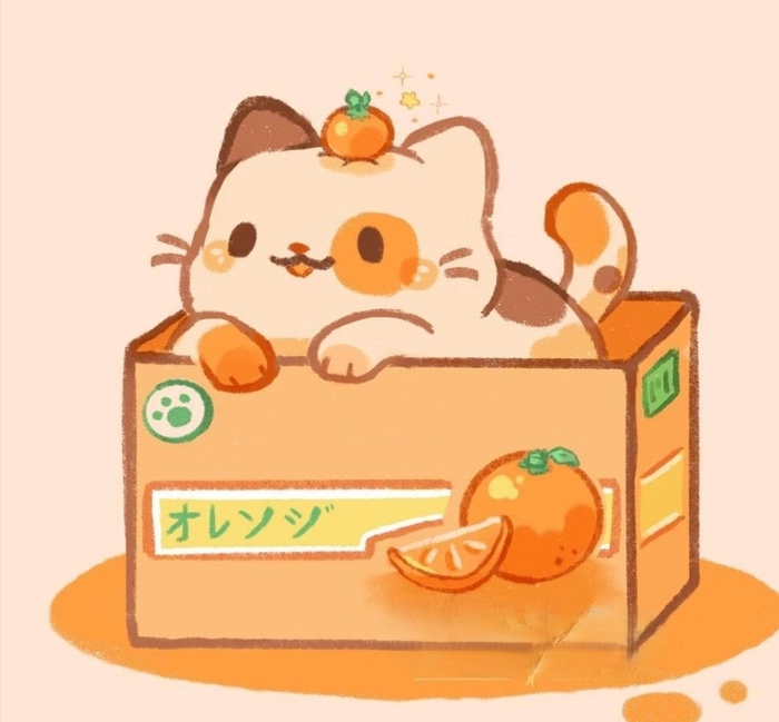
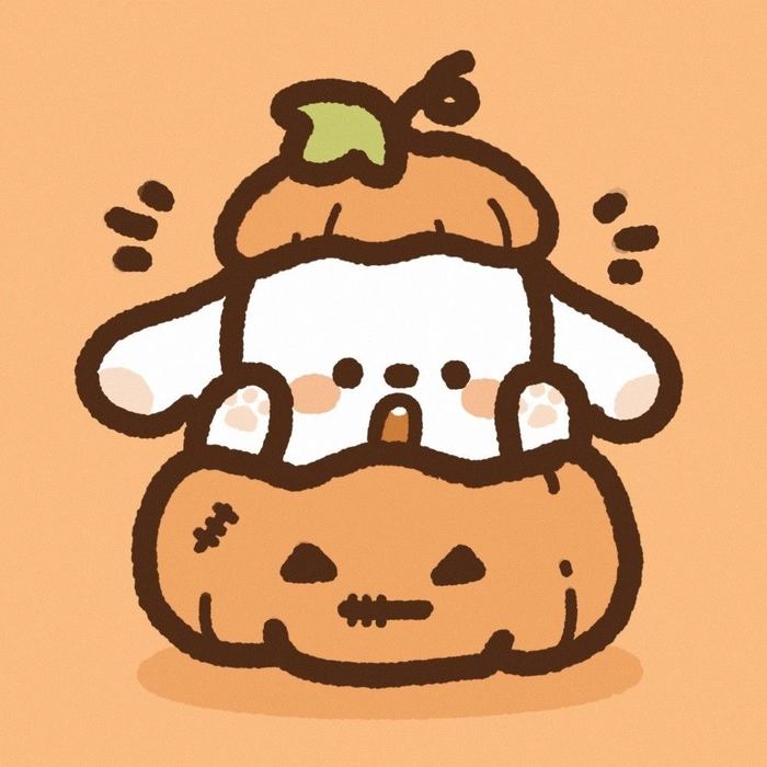
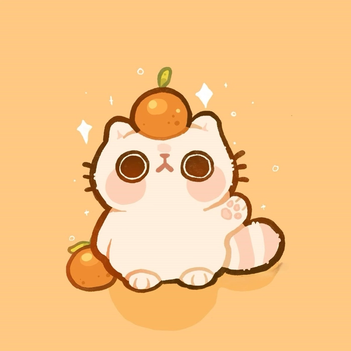
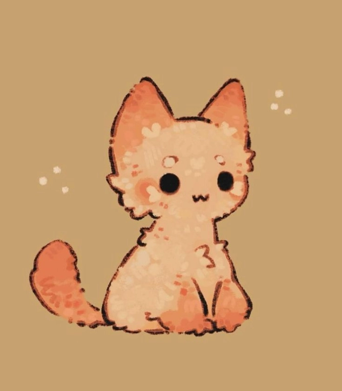
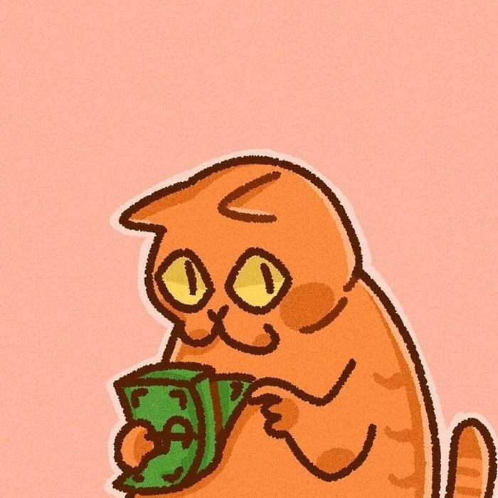
Meme communities, casual friend servers, and anyone who wants a profile that generates immediate recognition value without taking itself too seriously will find the funny orange cat direction consistently reliable. The cat does the personality work for you.
How to Pick and Use Your Orange PFP Across Platforms
Getting the most out of an orange PFP means matching the style to how each platform actually displays avatars — crop, compression, and size constraints vary enough to change which designs work best.
Orange’s warmth reads well on any platform, but the specific style needs to match how it’ll actually be displayed. Discord compresses avatars heavily and displays them at tiny sizes in chat — bold, high-contrast designs hold up best. Instagram uses square and circular displays depending on the context, so designs with strong central focus survive both formats. TikTok crops to a circle, so leave breathing room around the main subject.
A few practical things worth knowing before you save and set your orange PFP:
- Discord: 128x128px minimum — anything lower goes blurry in expanded views
- Instagram: 1:1 square ratio works best — circular crop is applied on top
- TikTok: goes circular in display, so centre-heavy compositions crop cleanly
- Twitter/X: stays circular across most views — avoid important details near edges
- Save as PNG instead of JPEG — keeps orange tones sharp, especially on dark backgrounds
- Avoid fine textures if you’re mainly using Discord — they compress into noise at small sizes
Read Also
Frequently Asked Questions
What is a good orange PFP color for Discord?
Saturated tangerine and bold amber tones work best on Discord’s dark interface. High contrast and a strong central focus hold up when the avatar is compressed to small sizes in chat.
Which anime characters are most associated with orange PFPs?
Naruto Uzumaki, Ichigo Kurosaki from Bleach, and Escanor from Seven Deadly Sins are the most recognized sources. Their fandom communities heavily favor orange avatar styles across Discord and gaming servers.
Do orange PFPs trend seasonally?
On TikTok and Pinterest, orange spikes in autumn alongside golden hour and cozy aesthetics. On Discord and gaming platforms, anime and character-based orange designs stay consistently popular year-round.
Can a plain orange PFP work for branding?
Yes. A flat solid orange with no additional elements reads as confident and minimal. The shade matters: burnt amber signals creativity, neon orange signals playfulness, deep rust signals something moodier.
What is the Annoying Orange?
Annoying Orange is a YouTube comedy channel launched in 2009 featuring a talking orange with an exaggerated face. It became one of the earliest mainstream internet meme formats and still carries nostalgia value in online communities.
How do I save an orange PFP without losing quality?
Save as PNG instead of JPEG to preserve sharp color tones, especially important for dark or high-contrast orange designs. Avoid re-saving JPEGs multiple times as compression degrades quality each pass.
What shade of orange works best for aesthetic PFPs?
Muted amber, burnt orange, and sunset gradient tones suit aesthetic profiles best. They read as intentional and curated rather than aggressive, and pair well with dark profile themes and warm-toned content feeds.