
350+ Cute Blue PFP: Aesthetic, Girl, Boy, Y2K, Anime and Discord Styles

Blue is one of those PFP colors that just works. Not in a boring, plays-it-safe way, but in a “everyone notices it and nobody can explain why” way. The right blue profile picture reads calm, intentional, and cool without ever trying too hard.
What you’ll find here: 350+ cute blue PFP options sorted by shade and style. Light and airy pastels, Y2K chrome blue, soft anime portraits, navy for darker platforms, baby blue, Pinterest-worthy editorial looks, and everything in between. Pick one that actually fits your vibe.
Why Blue Profile Pictures Land Differently Than Other Colors
Blue is the one color that reads as both calm and confident at the same time, which is why it works so well as a PFP choice across almost every platform and community.
Warm colors like red and orange demand attention. Neutral tones like black and white feel intentional but distant. Blue sits in a unique middle space: it signals that you’ve thought about your presence without making it feel like a performance. People register it as approachable before they process why.
There’s a staying-power element too. Trend-chasing PFP colors come and go. Certain shades of green blew up for a season. Neon had its moment. Blue, in every variation, has been a consistent top performer for years because it doesn’t read as a response to a trend. A soft blue anime portrait from two years ago still looks right on a Discord server today. That visual longevity is worth something if you want a PFP you won’t feel embarrassed about six months from now.
The Appeal of Light Blue Aesthetic PFPs
Light blue PFPs tap into something emotionally familiar: open skies, clean air, morning calm, the kind of color that makes people feel comfortable before they know why.


Sky tones and cloud-soft gradients work at any avatar size. They hold up in Discord’s tiny sidebar circles and look polished as a full Instagram profile picture. Light blue also plays nicely with both dark and light UI environments, which is genuinely rare. Most strong colors either fight with a dark theme or wash out on a white background. Light blue does neither.
Profiles leaning toward a gentle, approachable aesthetic consistently get more initial engagement on community platforms when they use cool pastel tones. Not a coincidence. Blue communicates openness, and openness invites conversation.
Cute Blue PFP Aesthetic Styles Worth Using
The sweet spot for cute blue aesthetics is between saturated and washed out: enough color to feel intentional, light enough to feel soft and non-aggressive.


Rounded compositions, gentle glow overlays, and harmonized pastel backgrounds define this category. Cute without being loud. Distinct without competing with the content around it. That adaptability is the whole point: a PFP shouldn’t fight your username or your feed for attention. The best ones quietly anchor your identity.
People in journaling communities, soft life spaces, and aesthetic Discord servers gravitate toward this style specifically because it communicates warmth without saying anything explicitly. The color does the emotional work before anyone reads a word.
Blue PFP Aesthetic for Girls
Blue is underused in feminine avatar aesthetics, which means a well-chosen blue girl PFP stands out in feeds dominated by pinks, purples, and warm tones.


Cool-toned lighting on skin reads beautifully in portrait format. Diffused backgrounds drop away so the face and expression carry everything. The goal isn’t dramatic or high-contrast. It’s softness with a clear personality behind it, which is a harder balance to pull off than it looks.
In communities built around anime culture, soft life content, or creative aesthetics, a blue aesthetic girl PFP lands as refined and self-aware rather than trying-too-hard. That distinction matters. Pink reads expected. Blue reads like you made a choice.
Blue Profile Picture Girl Styles
Portrait-forward blue profile pictures prioritize face and expression, using the color as emotional framing rather than the main event.


At small sizes, a portrait with a consistent blue tone reads faster than any busy composition. The recognition principle applies especially in messaging apps and community servers: people need to identify you quickly, and a clean portrait gives them something to lock onto.
Minimal backgrounds strip away noise. Cool lighting contours without harshness. The composition does its job without demanding more attention than necessary, which keeps the focus exactly where it should be.
Blue PFP Y2K Chrome and Electric Styles
Y2K blue throws out soft and airy entirely: chrome finishes, iridescent overlays, bubble effects, and electric gradients that pull straight from early 2000s web culture.


Gen Z’s relationship with late 90s and early 2000s internet aesthetics has moved well past irony at this point. Y2K is a genuine aesthetic position, not a throwback joke. Gaming communities, creative Discord servers, TikTok-adjacent profiles, and anyone building a digital identity around visual edge respond to this energy because it signals cultural awareness without trying to be subtle about it.
The contrast with softer blue styles is the whole point. Where pastel blue says “approachable,” Y2K blue says “I know what I’m doing and I’m having fun with it.” Different community, different signal, both valid.
Cute Blue PFP Pinterest Editorial Looks
Pinterest-style blue PFPs look like they were composed with intent: even lighting, placed color, film-grain texture, and harmonized palettes that feel editorial rather than spontaneous.


Nothing in the frame looks accidental. That’s the point. Moodboard culture, journaling communities, and lifestyle content creators recognize this visual language immediately because they use it in their content. When your avatar speaks the same aesthetic dialect as your feed, your entire profile reads as considered rather than assembled.
Blue tones in this style appear placed rather than filtered, which is a subtle but meaningful distinction. Filters are reactive. Color placement is intentional. Profiles built around curated grids and personal brand aesthetics respond especially well to this approach.
Cute Blue Profile Picture Styles for Girls
Blue as a feminine avatar color offers something most warm palettes can’t: it stands out in feeds full of pinks and peaches while still reading as soft and approachable.


Subtle sparkle accents and light diffusion keep these styles playful without tipping into overly decorative territory. Smiles and warm eye contact carry the emotional weight while the blue palette keeps everything calm. The combination works because expression reduces perceived social distance and cool color harmony keeps the visual impression composed.
For building a consistent identity across TikTok, Discord, and Instagram, blue offers a real practical advantage: it adapts across all three without needing platform-specific edits. Pink sometimes reads too warm for Discord’s dark UI. Blue doesn’t have that problem.
Cute Blue PFP for Discord Servers
Blue handles Discord’s technical scale problem better than most colors: cool tones maintain contrast against dark UI without harsh edges, glare, or visual bleed at tiny sizes.


Discord avatars live at 32px in most sidebar and thread contexts. That’s tiny. High-contrast or busy compositions fall apart at that scale. Soft blue with a clean silhouette survives the compression and stays recognizable, which is the main job an avatar has on Discord.
There’s a social dimension too: in gaming and community servers, calm-palette avatars tend to invite more initial interaction than aggressive or dark-dominant styles. People unconsciously use avatar tone as a social cue. Blue says open. And open invites conversation.
Cute Blue Cat PFP Styles
Blue cat PFPs combine feline silhouette, exaggerated soft features, and an otherworldly blue palette into something immediately recognizable as comfort-character energy.


These aren’t realistic cats. Nobody wants them to be. They’re stylized, soft, slightly dreamlike, and that’s the entire appeal. Character-based avatars communicate personality without showing a face, which is exactly why they’re popular across gaming communities, cozy Discord spaces, anime servers, and fandom communities alike.
The blue tone adds visual specificity that makes the avatar memorable without being loud. A generic cat avatar blends. A blue cat avatar with dreamy tones and oversized eyes gets remembered, which is the actual goal of any profile picture.
What These Cute Blue PFPs Say About You
Blue as a PFP choice communicates calm, intentionality, and visual awareness without saying a word. The shade you pick narrows it down to personality.
A blue profile picture says you’ve considered how you come across, even if the decision happened in under a minute. The restraint blue communicates is itself a statement. People who gravitate toward loud, high-contrast, or intensely colorful avatars signal one kind of presence. Blue signals a different one: considered, calm, and not looking for attention from every corner of the feed.
The sub-choices within blue are where the nuance lives. Baby blue reads as soft and openly warm, the avatar of cozy community members and soft life accounts. Navy reads as composed and a little private, popular among users who want presence without volume. Y2K chrome blue reads as trend-aware and playfully confident, a favorite in creative and gaming spaces. Anime blue reads as community-oriented and expressive, immediately legible as fandom-adjacent. People pick up on these distinctions faster than they realize, even at tiny avatar sizes.
Navy Blue PFP Styles for a More Reserved Look
Navy is the low-key choice in the blue family: darker, more composed, and suited to users who want a consistent presence without visual noise.


Navy doesn’t ask for attention the way electric or pastel tones do. The depth adds weight and a certain sophistication while the blue undertones keep it from reading cold or unapproachable. It’s the version of cute that skews toward mature, which is exactly what some users want.
Discord night mode and dark-theme applications display navy beautifully: it integrates rather than pops, giving users a consistent, recognized presence without standing out in a way that feels performative. Professional-leaning profiles and more reserved communities tend to reach for this palette for exactly that reason.
Light Blue and Baby Blue PFP Options
At the softest end of the spectrum, light blue and baby blue PFPs offer maximum warmth and visual openness: no heavy tones, no clutter, just clean and friendly energy.


High-key lighting, clean gradients, minimal shadows. Light blue is the most universal option in this collection because it avoids locking you into any specific subculture. Not anime-coded, not gaming-coded, not indie-coded. It works across contexts without friction, which makes it the safest bet for anyone who wants a coherent avatar without committing to a particular aesthetic identity.
Baby blue sits even softer: saturation drops to almost a whisper, edges diffuse, and the impression becomes tender and emotionally warm. Youth-adjacent platforms and soft life communities respond especially well. It communicates innocence without naivety, warmth without trying.
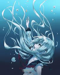
Cute Blue Anime Girl PFP Picks
Blue anime girl portraits combine expressive character art with a cooling palette that broadens appeal well beyond dedicated fandom spaces.

Large eyes and stylized anime features get softened by the blue color treatment. Hair tones, background gradients, and glow overlays harmonize around the cool palette instead of clashing. The result is expressive without being intense, which is exactly why these travel well outside dedicated anime servers.
Blue specifically does something useful for anime-style avatars: it softens the contrast that high-saturation anime art sometimes leans into, making the style more accessible to users who aren’t deep in fandom but are drawn to illustrated aesthetics. A pastel blue anime portrait fits in almost any aesthetic community without friction.
Blue Lock Cute PFP Options for Fans
Blue Lock PFPs bring sports anime energy into profile picture format: fandom-signal without the aggressive competitive edge the series is known for.


Characters like Isagi Yoichi, Bachira Meguru, and Rin Itoshi carry strong visual identities. The blue uniforms and match-day intensity of the Blue Lock series convert well into avatar format because the character designs are distinct and recognizable at small sizes.
The cute angle is a deliberate choice. Fans who want the fandom signal but not the aggressive rivalry energy that defines the series pick this style. In anime community servers and sports discussion spaces, it reads as enthusiastic and culturally aware without performing intensity.
Cute Blue PFP Anime Styles Beyond Fandoms
Soft blue anime avatars work across communities because the calming palette extends the appeal of expressive illustrated character art far beyond dedicated fandom spaces.

Smooth shading, pastel tones, and glow overlays unify the composition. Large expressive eyes catch gentle lighting. The character style signals community and taste without requiring anyone to know exactly which series it’s from. That’s a genuine advantage on general-interest platforms where niche fandom signals can isolate rather than connect.
Anime avatars are identity-driven choices. The style, palette, and character expression all communicate something about who’s behind the account. Blue palettes specifically say “expressive but not intense,” which lands well in almost any digital community context.
Cute Blue PFP for Instagram Profiles
Instagram’s small circular crop on a white grid is a specific visual challenge: blue handles it reliably because pastel tones stay readable without glare or washout.

A cohesive blue avatar does something extra for lifestyle and aesthetic content accounts: it extends the color story of the feed into the profile picture itself. When the avatar palette aligns with the content aesthetic, the whole profile reads as intentional rather than assembled from separate pieces. Blue is calm enough to let feed content lead while still contributing to the overall visual impression.
Center-heavy compositions survive Instagram’s compression and circular crop better than edge-detail-heavy ones. Keep the main subject in the middle third and make sure the silhouette is clear at thumbnail size before committing.
Cute Blue PFP Boy and Masculine Styles
Soft masculine blue avatars challenge the visual norms that dominate male profile pictures online, and gaming communities increasingly welcome that shift.


Cool lighting that contours without hardening, neutral backgrounds, relaxed expressions. A cute blue PFP for boys reads as self-aware and socially open. In many community contexts, that’s a social advantage, not a liability. Aggression and intensity communicate one thing. Calm and approachable communicate something more useful in spaces built around conversation and shared interest.
The soft register for male-coded profiles is more visible now than it was a few years ago, especially in spaces influenced by anime culture and K-pop community aesthetics. Blue fits naturally into that visual landscape.
Light Blue PFP Aesthetic Minimalist Styles
Minimalist light blue aesthetics are built on restraint: clean backgrounds, gentle gradients, and balanced saturation that looks polished without looking produced.


The aesthetic lands without effort, which is exactly the impression it’s going for. For users building a personal brand across platforms, light blue minimalism travels well: it complements color-forward feed content without competing with it. The avatar becomes a frame rather than a statement, which gives your content more room to lead.
Editorial control defines the Pinterest variation: magazine-like clarity, consistent pastel saturation, clean framing. Every element feels placed with intention, which communicates visual sophistication that curated-content communities recognize and respond to.
Cute Blue PFP Girl Portrait Styles
Feminine blue avatar portraits blend approachability with visual intention: pastel lighting flatters, rounded shadows soften, and the blue palette keeps everything from tipping warm or harsh.


Sweet without being saccharine. Social communities respond warmly to this visual register because it reads as kind, relatable, and aesthetically conscious all at once. The refined portrait variation skews toward editorial: balanced color temperature, gentle lighting that maintains dimension, centered composition. It lands equally well on lifestyle blogs, creative portfolios, and curated social feeds.
For users who want a PFP that holds up across casual and aesthetic-focused contexts without any platform-specific edits, cute blue girl portrait styles are among the most adaptable options in this collection.
How to Save and Use These Cute Blue PFPs Without Them Looking Off
The right image saves in two seconds. Getting it to look right as a circular profile picture on four different platforms takes slightly more thought than that.
Blue PFPs with strong center subjects and clean silhouettes survive platform compression better than anything detail-heavy near the edges. Before committing to any image as your main avatar, open it on your phone and zoom out until it’s roughly thumbnail size. If the main subject still reads clearly, it’ll hold up everywhere. If it blurs into noise, find a tighter crop.
Platform-specific things worth knowing before you save:
- Discord: minimum 128x128px but goes as small as 32px in sidebars, so silhouette clarity matters more than fine detail
- Instagram: circular crop on a white background, 1:1 ratio, center-heavy compositions work best
- TikTok: displayed as a circle, so leave breathing room around the face or subject
- Twitter/X: stays circular in most views, center-heavy crops land reliably
- Save as PNG instead of JPEG to keep blues sharp, especially for darker navy or gradient styles
- On mobile, press and hold any image here to bring up the save option. On desktop, right-click and select save image
Read Also
Frequently Asked Questions
What is the blue aesthetic?
The blue aesthetic uses cool-toned palettes, soft gradients, and calm imagery to create a visual mood of openness and intentionality. It spans pastel, navy, Y2K chrome, and anime styles.
Can I use these cute blue PFPs on Discord?
Yes. Blue tones maintain contrast against Discord dark UI without harsh edges. Soft or navy styles with clean silhouettes hold up best at Discord small avatar sizes of 32px.
What does a blue profile picture say about you?
Blue avatars read as calm, approachable, and intentional. Pastel blue feels open and gentle, navy feels composed and private, Y2K blue reads as trend-aware and playful.
Are cute blue anime PFPs usable outside anime communities?
Soft pastel blue anime avatars travel well outside fandom spaces. The calming palette broadens appeal. Highly stylized art can feel niche, but pastel illustrated styles fit almost any community.
How do I save a cute blue PFP to my phone?
Press and hold any image to bring up your device save option. On desktop, right-click and choose save image. Crop to square before uploading and save as PNG to keep blues sharp.
Which cute blue PFP style works best for Instagram?
Pinterest-style and light blue aesthetic options perform best on Instagram. Even lighting, clean framing, and harmonized palettes match Instagram preference for polished visual consistency.
Is baby blue or navy better for a soft aesthetic profile?
Baby blue fits soft and cozy aesthetics more naturally. Navy skews mature and subdued for minimalist styles. Both avoid visual noise, but baby blue reads warmer and navy reads more composed.


